I’m one of those strange people who has always enjoyed doing performance testing. The thought of spinning up lots of machines to do my bidding and generate loads of tasty data to analyze just makes me happy. Very happy.
And even though I’ve been an ex-Tabloid for going on four years now, I still love my Tableau. You see where this is going, I’m sure: It’s been a while, and Russell needs to test something. That something just has to involve Starburst and Tableau, and so I figure a good candidate to compare Starburst against is Trino.
So, I created 8-9 dashboards using data from the TPC-DS dataset. I mostly used TPC-DS queries straight-up, because why invent the wheel. I also wanted to simulate the sort of Data Source a Tableau user might build against TPC-DS. So, I also created an additional Tableau data source from scratch and joined together the various tables I needed vs. using Custom SQL queries.
I wanted a robust dataset, so I went with Size Factor 1000, which is about a terabyte of data. Here are some sample row counts in the primary tables I used:
- catalog_sales: ~1.4b rows
- store_sales: ~720m rows
- web_sales: ~2.8b rows
(Want to learn more about TPC-DS? Here’s a good third-party summary.)
This data is stored as Parquet on AWS S3 and accessed directly via Starburst/Trino via our Hive Connector.
For testing, I’m using two AWS EKS clusters, one to run Starburst, the other for Trino. Each cluster consists of seven r6g.8xlarge instances (256 GB RAM, 32 vCPU per box). On each seven machine cluster, six instances act as workers and one takes the role of coordinator.
TLDR;
Tableau is just better with Starburst because Starburst is generally a cut above Trino when it comes to getting results back fast — at least on the TPC-DS workload I used. Naturally, this shouldn’t be a surprise since performance is one of the value pillars the Starburst team is constantly focused on. Additional capabilities like Materialized Views stored on Delta Lake or Hive make Starburst great on top of any lake.
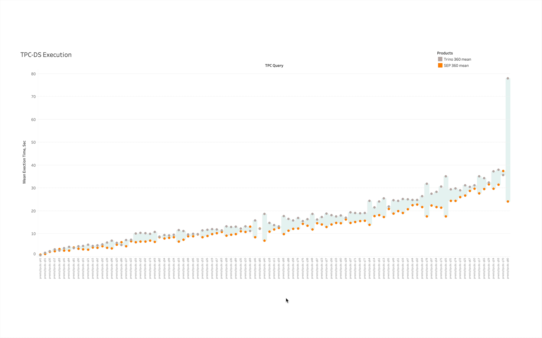
Here, for example, are (uncached) mean execution times for Starburst and Trino LTS 360 on all of the standard TPC-DS queries. This data was wheedled out of our engineering team which runs performance benchmarks against every release we ship:

Grey circles represent Trino query execution time, orange circles are for Starburst. I used the lighter-blue “filler” between marks to represent the difference between the two –- it’s one of the many bonuses you get for using Starburst.
Out of the 99 queries being executed, I could only identify ~5-6 instances where Starburst wasn’t faster. And by the way, what initially might look to be a pretty close race performance-wise often represents a pretty big difference in execution time:
If you don’t feel like taking the trouble of reading all of my fine prose (shame on you), here are the results of the investigation I took on:
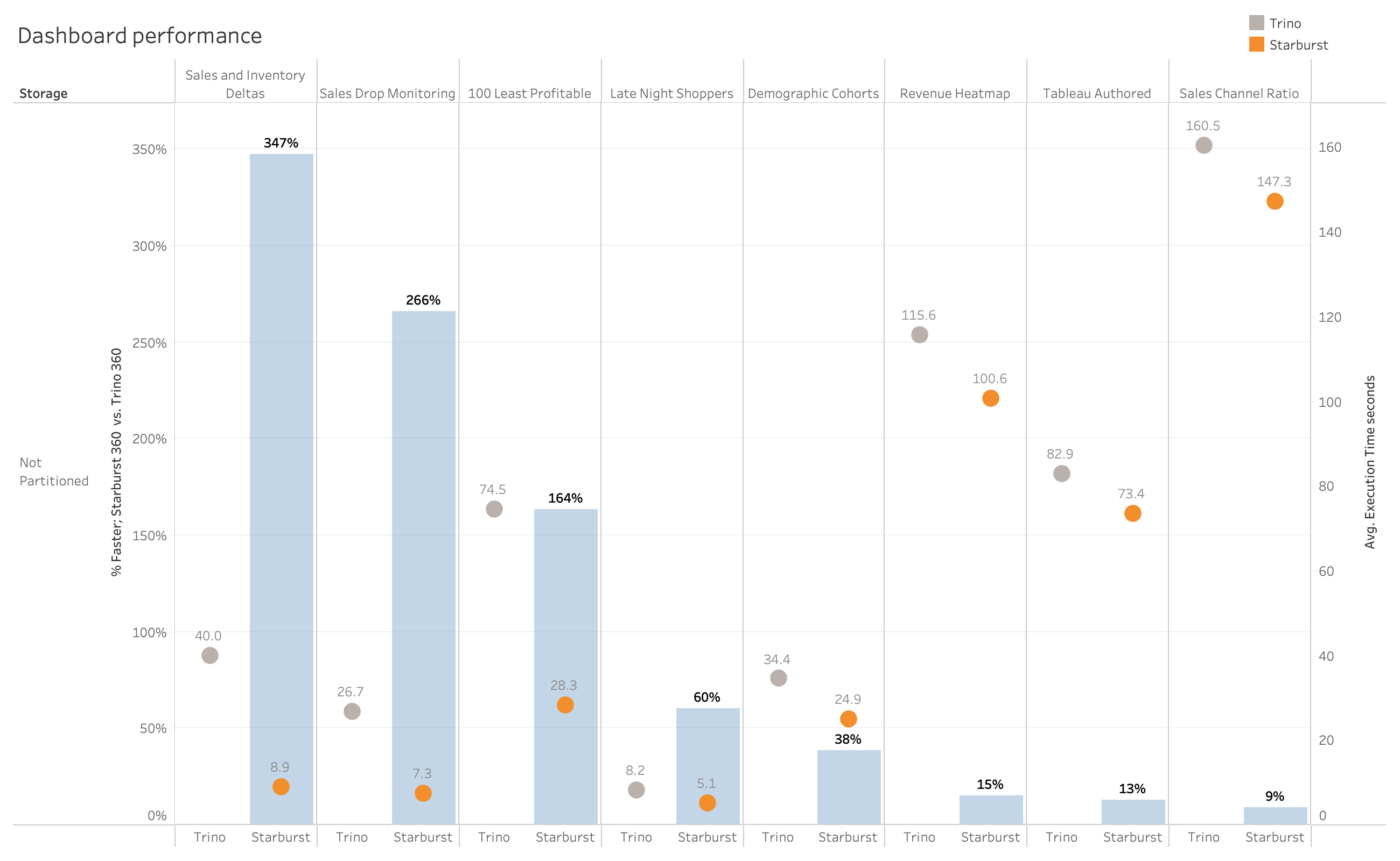
Tableau dashboards running the same queries against the same data on the same hardware executed between 9% to 347% faster on Starburst.
Dashboard execution times don’t tell the whole story, however. Tableau is great at optimizing behind the scenes and can often give the user high perceived performance by doing smart (and sneaky) things like parallel query execution. So, it’s important to look at all the queries BEHIND these dashboards, too. We’ll do that later by leveraging Tableau’s Performance Recorder tool.
The Tableau Dashboards
Below I’m going to survey a sampling of the dashboards I created. For the dashboard design bigots in the room, I (ahem) clearly was not trying to create the perfect collection of visualizations here. Instead, the goal was to have a selection of vizzes that looked real-world-ish in terms of what people might build:
- A few focused on text and lists
- A couple were busy and showed lots of detail
- Most were high-level aggregations of lots of data which some basic capabilities around filtering and sorting built-in.
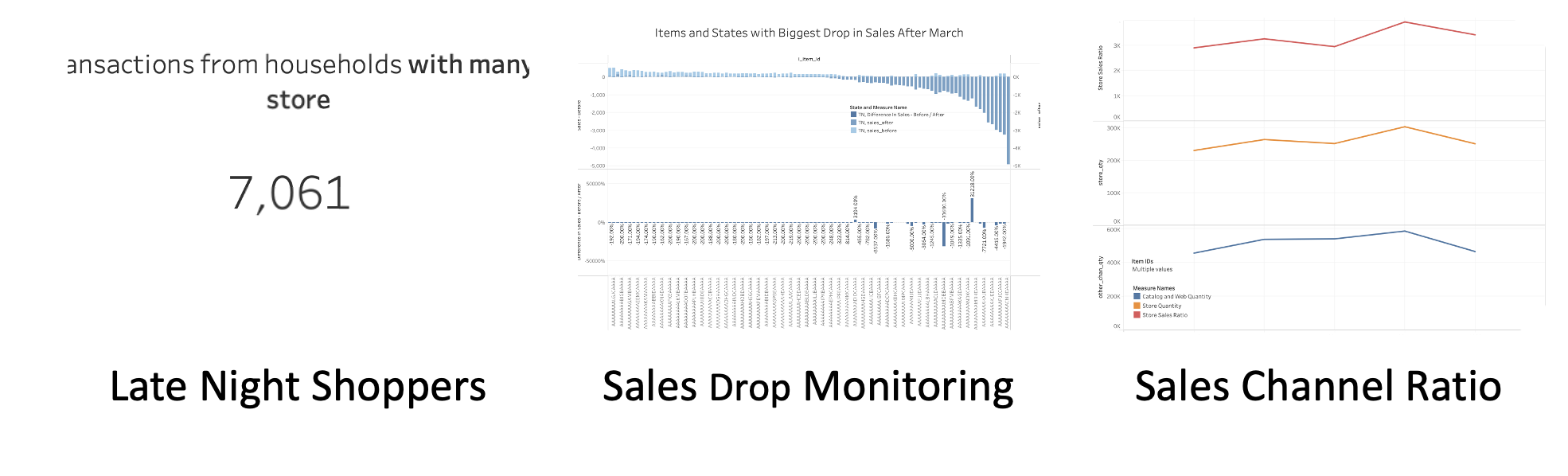
Sales and Inventory Deltas
Worksheet #1: Calculate the sales (including returns) for 30 days before and after 11-mar-2000 for items with a price between $0.99 and $1.49.
Also, calculate the difference between these two values. Requires a moderately complex query that joins 5 tables and does some basic CASTing.
Worksheet #2: Calculate store inventory for the same two 30-day periods and display them as “before” and after. Utilizes a similar query as above.
100 Least Profitable Items
This one is a little mind-bendy
- Using common table expressions, calculate sales, returns, and profit for store_sales between 23-aug-2000 and 30 days after 23-aug-2000 where price is > $50 and the item is currently not on a TV promotion. This CTE requires 6 joins.
- Using the same approach above, repeat for catalog and web_sales.
- UNION the 3 results from above
- Sort DESCENDING by profit and return the 100 “worst” rows (in the screenshot below, the 100 worst all happen to be catalog sales).
The top viz groups results by measure (sales, returns, profit), and when a bar is clicked, details rows are displayed below. The details rows use the same query as described above.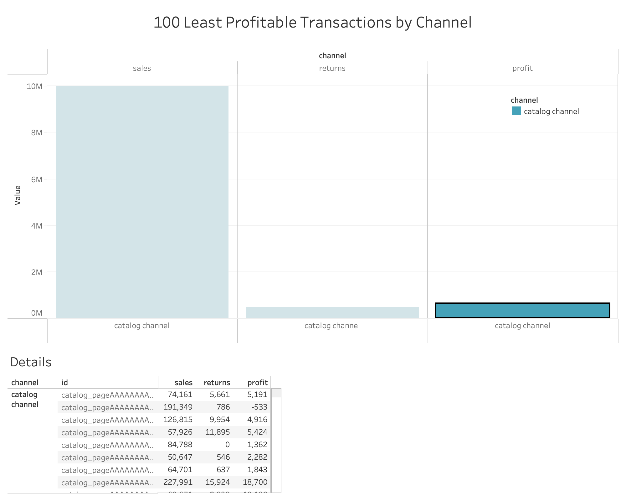
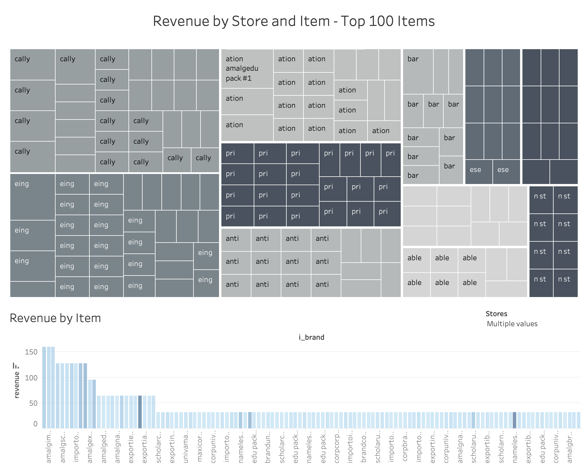
Revenue Heatmap
Calculate the sum and average of revenue, return top 100 items based on same. Group by Store.
“Tableau Authored” Dashboard (Metrics and Demographics)
This dashboard is somewhat unique in my testing cohort for two reasons:
- It does not leverage known, tpc-ds queries. Instead, I joined together five tables in the tpc-ds sf1000 schema directly in Tableau. I’m letting Tableau make all the decisions around RIGHT and LEFT joins, etc.
- It returns lots of data and renders (too) many marks – about 1.2 million
- It also happens to execute the most queries out of all the dashboards: seven queries are fired each time the dashboard is run

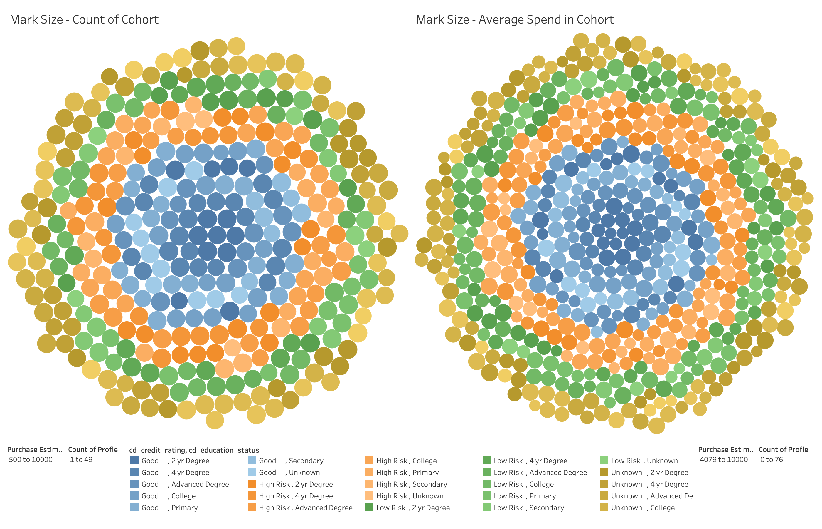
Demographic Cohorts
Using a subquery, identify a group of customers who have purchased from the Store channel, but NOT from either the Web or Catalog sales channel. Purchases must have been made in 2001 on either Wednesday, Thursday, or Friday. Group these customers by several demographic criteria (Gender, Marital Status, Education, Credit Rating, Estimated Purchase size) and then count the number of customers in each cohort. In addition, create an Average Spend metric for each group. Plot both.
The Rest
Here are some of the less-interesting dashboards that were also part of the workload, presented without descriptions of what they do, and how:
Three Bullet Tableau Performance Primer
Let’s start the conversation by saying you need to (nay, you must) read the seminal work on Tableau Performance (registration required), originally by Alan Elridge.
I’m sure I’ll get a Telegram from Alan in about a week with some wise-ass comment about how I’m taking liberties with his baby, but what follows is the shortest summary (ever) of his work:
- Slow dashboard? It’s probably your queries. Check them, check the database, connections to the database, etc.
- Not your queries? You’re rendering too much stuff. Draw fewer marks, use fewer filters, and in general make your dashboard less complex.
- When in doubt, refer to bullet #1
You use the Tableau Performance Recorder to get under the hood on your dashboards to identify and quantify your issues. During this whole exercise, I used Performance Recorder to record query and dashboard execution times. Here’s an example of the basic output from the Demographic Cohorts dashboard:
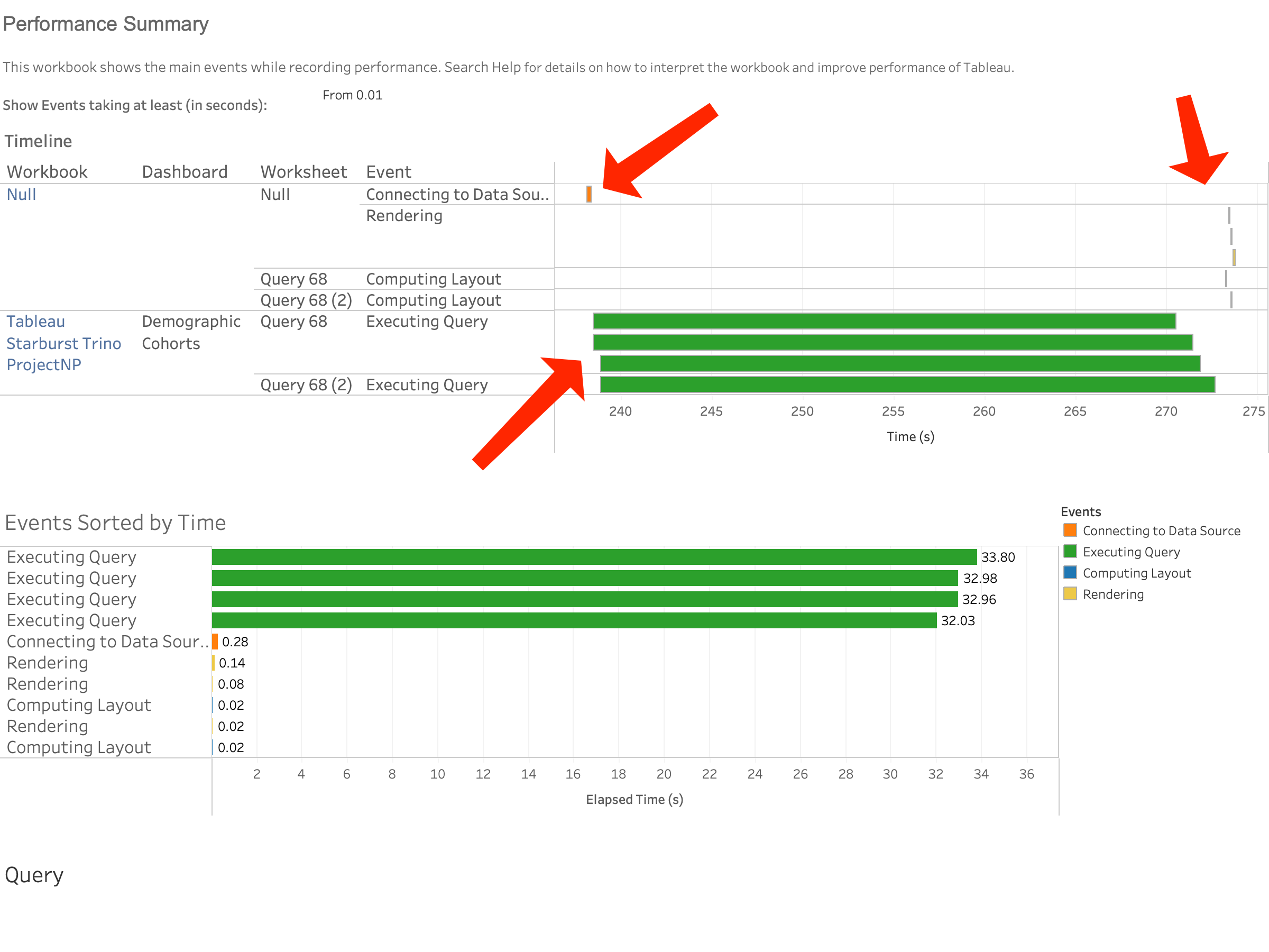
Connect
We start monitoring performance shortly before the initial Connection to the data source is made. That work is represented by an orange mark. The size of that mark tells us how long it took to connect. I can see that about 235 seconds after we opened Tableau, we begin making a connection, and that the connection happened pretty quickly.
Query Execution
Next, we start executing queries. And no surprise (see bullet #1), they take up the lion’s share of the clock time we’re measuring and therefore impact perceived performance the most. What’s interesting here is that Tableau actually fired four queries in parallel. Why? If you look at the screenshot of this dashboard, you’ll note there are two worksheets and two sets of identical filters:
- One query for the left-hand viz
- One query for the right-hand viz
- One query to figure out the min and max values displayed for filter #1
- One query to figure out the min and max values displayed for filter #2
Four queries.
Rendering
After the necessary queries have finished executing, we layout and render the dashboard. Since our example viz has many (but not a TON) of marks, this happens pretty quickly.
Dashboard Execution Time
There are arguably different ways to quantify “how long” it takes for a dashboard to execute, but the way I measured it is as follows:
([Data Connection Start Time]) – ( ([Start Time of Final Rendering Event] + [Elapsed Time of Final Rendering Event])
Tableau Performance Final Thoughts
In summary, Tableau dashboard performance is “all about the queries”. But not always.
Rendering TONS of marks takes lots of time and horsepower – and that’s not a query execution issue.
If it takes a really long time to connect to a database, you can’t even start executing your queries. That situation can arguably be a data system issue, it could be the network – but it’s not a measure of query performance.
Tableau sometimes can take a while to figure out what queries should be fired and why. It also can take a while to consider how a viz should be laid out before rendering occurs. Not a query issue.
So it’s always important to look at query execution in a vacuum where you can. Nice setup for the next section, eh?
Query Performance
Below, you’ll find query performance data for all the dashboards I ran. Each data point is the average (mean) of two runs of the dashboard.
There’s a lot going on, and so I chose to filter out all queries which took < 1s to execute. So for example, while the “Tableau Authored” dashboard executes seven queries, you’ll only see four documented below.
Just out of curiosity, I also ran my tests against data that was partitioned and un-partitioned, just to see what would happen. Across both partitioned and un-partitioned data, Starburst ran about 37% faster. Not too shabby.
(BTW, against unpartitioned data, Starburst really kicked tail – executing this set of queries almost 60% faster)

There’s a LOT of data above, which sometimes is hard to wrap your brain around in aggregate. This whisker plot is a great way to look at this data at a 10,000-foot level. Each mark (circle) represents a different query. The circles are colored based on which dashboard they were executed by. I created an animated GIF of the viz as I moved through each dashboard so you can see a bit deeper into the data.
Topline, for both partitioned and unpartitioned data, Starburst’s mean execution time was slower, and the grouping of queries was tighter.
The Joy of Materialized Views
And don’t forget Materialized Views! Materialized Views are not unique to Starburst, but Trino only supports storage to Iceberg, while Starburst can leverage any storage accessible via Hive or Delta Lake. In addition, Materialized Views in Starburst can be refreshed on a schedule using our built-in Cache Service.
Materialized Views are a down-and-dirty, unfair advantage when it comes to increasing perceived performance because you pre-compute the lion’s share of your “answers” ahead of time. To illustrate this, I took two of our dashboards and pointed them to a “personal” cluster of mine (Yes, we have those ).
It is a less-robust five node rig running r3.4xlarges (122 GB RAM, 16vCPU), and I’m utilizing smaller TPC-DS Size Factor 100 data.
I executed my two dashboards “as is”, then created a materialized view to “cover” the SQL Tableau throws at Starburst.
Here’s the Performance Recorder report for Sales Channel Ratio:

Note two query executions at around 80s each. Fine.
Next up, the same dashboard against a Materialized View:
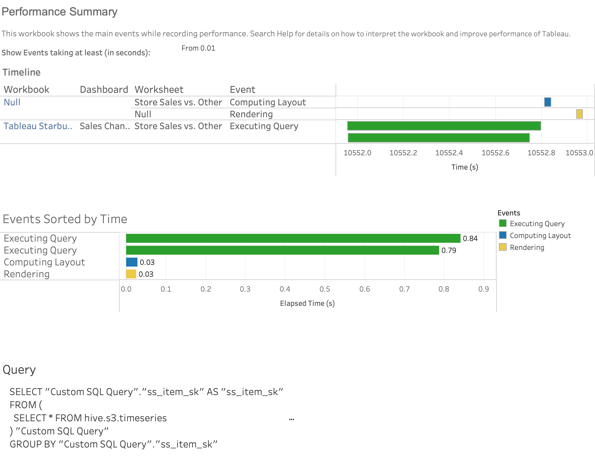
Doh! Those queries ran in less than a second.
Here’s another. Revenue Heatmap. Before:
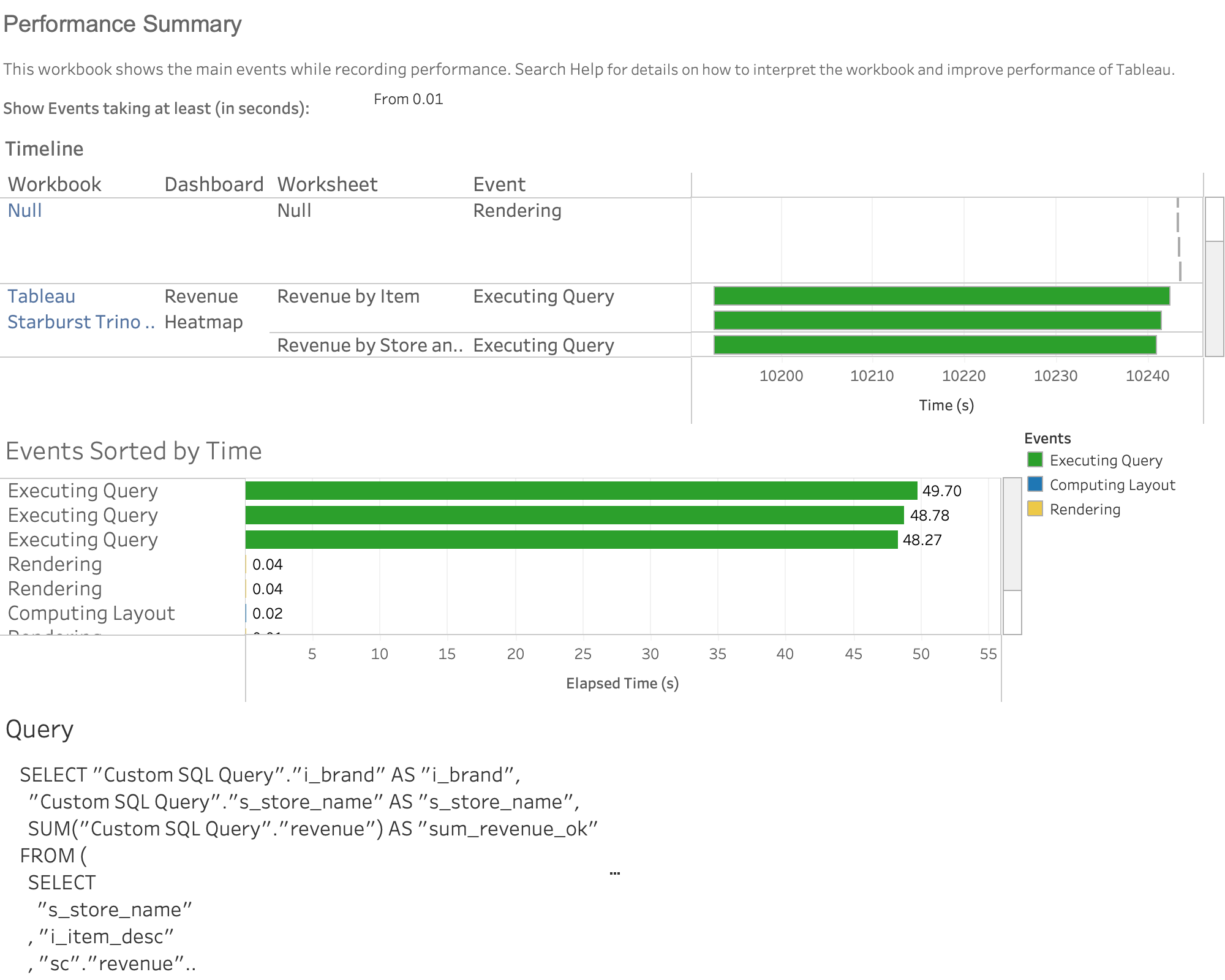
…and after:

I fat-fingered my password above, so it literally took longer to type it in (the long Connecting to Data Source bar) than it did to execute the 3 queries that drive this baby!
Materialized Views. Good stuff. Mike drop.
Summary
I love Trino. It’s my second-favorite analytical query engine of all time. That said, I’m bringing Starburst to the prom. The Starburst engineering team has constantly and consistently focused on making Starburst more-and-more performant since the beginning. Those improvements (both small and large) have added up over time and make Tableau plus Starburst a no-brainer for the data analyst and citizen data wrangler.